
DubDub Toys
A-Frame Store Front Sign Design
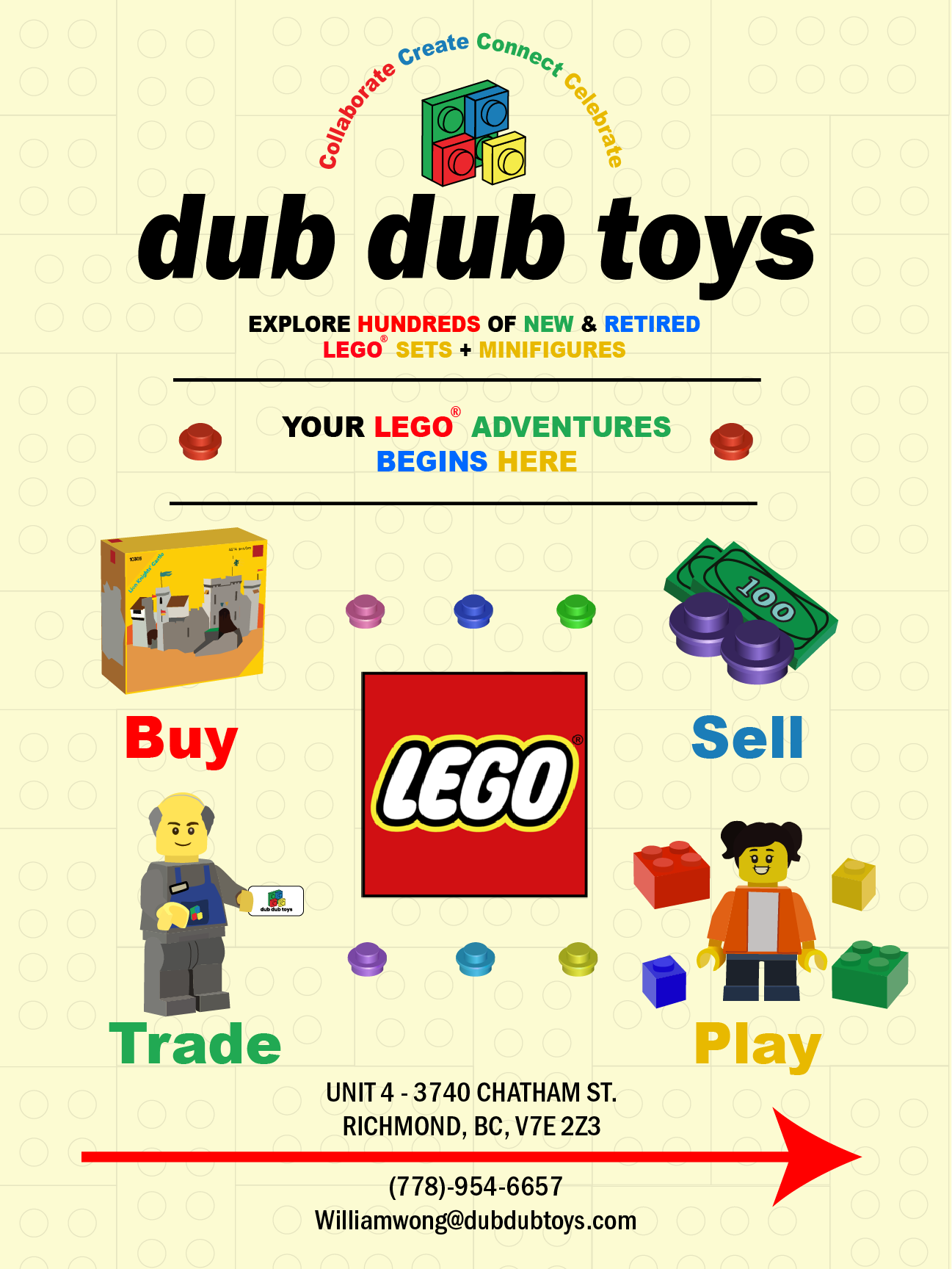
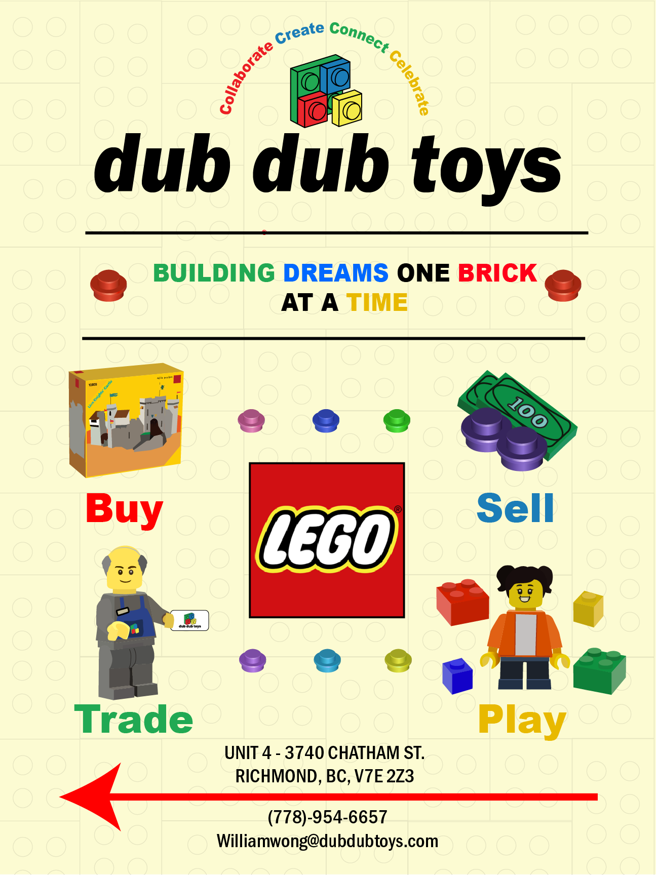
I designed a high-visibility sidewalk sign to increase discoverability for a newly opened LEGO reseller store.
The Problem
The store’s location and existing signage made it easy for potential customers to miss it. The client needed a sign that would stand out on the sidewalk and clearly communicate what the store offered.
- Increase visibility from the street and foot traffic
- Communicate brand and services at a glance
- Create a durable, readable sign suitable for outdoor use
My Approach
01. Brand Recognition
I focused on making the sign instantly recognizable as DubDub Toys—using LEGO-inspired visuals and a clear brand presence so passersby could identify the store at a glance.
02. Visibility & Scale
I designed for high visibility from the street: bold type, strong contrast, and a layout that reads clearly from a distance. The A-frame format allowed for double-sided visibility and a size that stands out on the sidewalk.
03. Information Hierarchy
I organized the sign so the most important information—what the store does (buy, sell, trade, play)—is immediately clear, with supporting details (contact, location) easy to find without clutter.
Iterations & Process
I moved from early concepts to refined layouts, testing readability and legibility at different distances and adjusting the balance of imagery and text so the sign would work from both sides of the A-frame.
Some challenges I addressed:
- Balancing brand personality with clear, scannable information for pedestrians
- Designing for two sides so the sign reads well from either direction
- Keeping the layout flexible for future updates (events, hours, or messaging)
Directional Design
The sign acts as a wayfinding element—pointing customers toward the store. I used strong directional cues and clear store details (address, phone, email) so people could find DubDub Toys and get in touch.
DUBLIN OH 43016
Phone · Email
dub dub toys
DUBLIN OH 43016
Phone · Email
dub dub toys
Final Outcome
The final A-frame sign increases street-level visibility for DubDub Toys and clearly communicates the store’s buy, sell, trade, and play offerings. The two-sided design works from both directions and gives the new LEGO reseller a strong, recognizable presence on the sidewalk.
Reflection
This project reinforced how much impact a single, well-placed sign can have on discoverability. Balancing brand personality with clear hierarchy and directional information—and designing for two sides—taught me to keep every element purposeful. I’m pleased with how the sign helps a small store stand out and invite customers in.